Colour in Design
Colours can be used for far more than visual stimulus - it has the ability to convey emotions and intent. Having the ability to utilise colour theory in design will allow your content to shine.
In this post, I will be going over the essential tools to help you use colours to your advantage, and ensure your designs stand out in the right way.
Colour Psychology
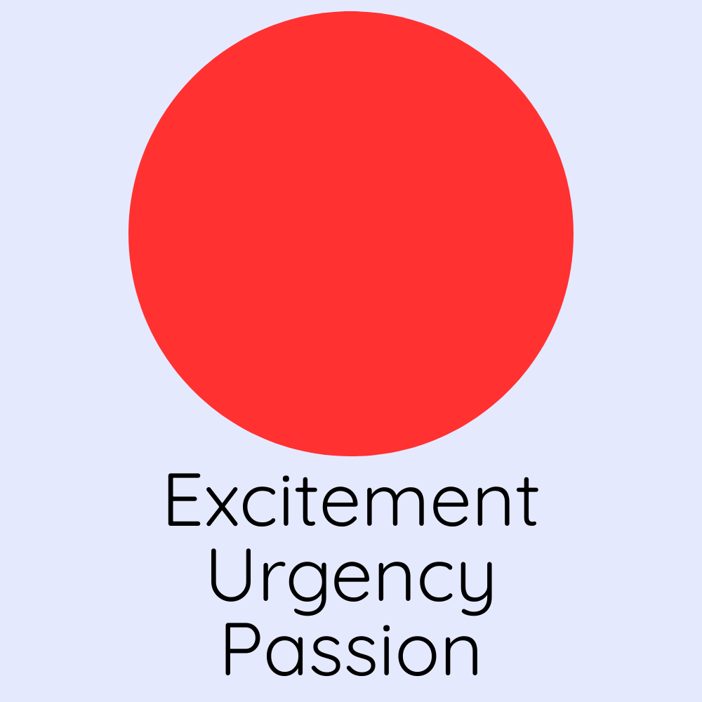
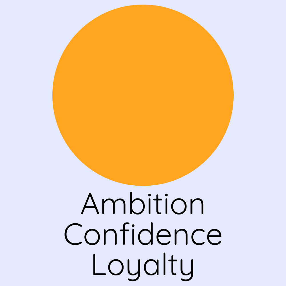
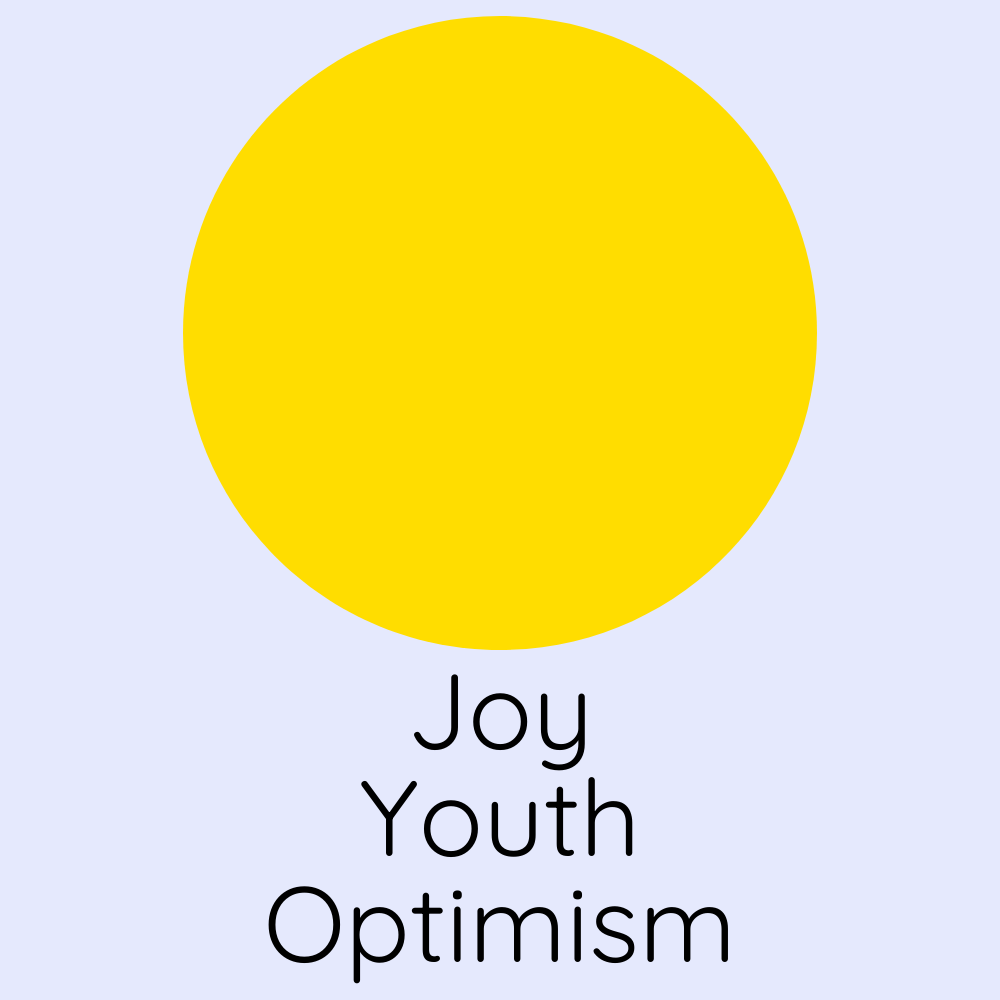
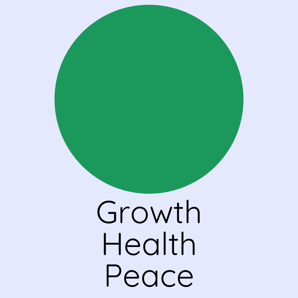
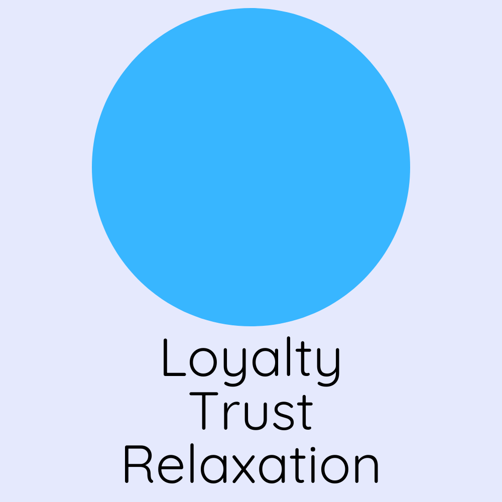
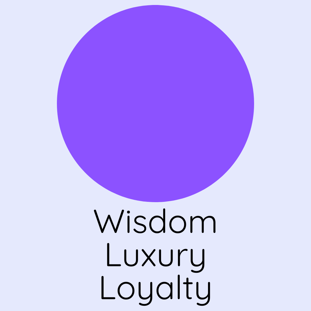
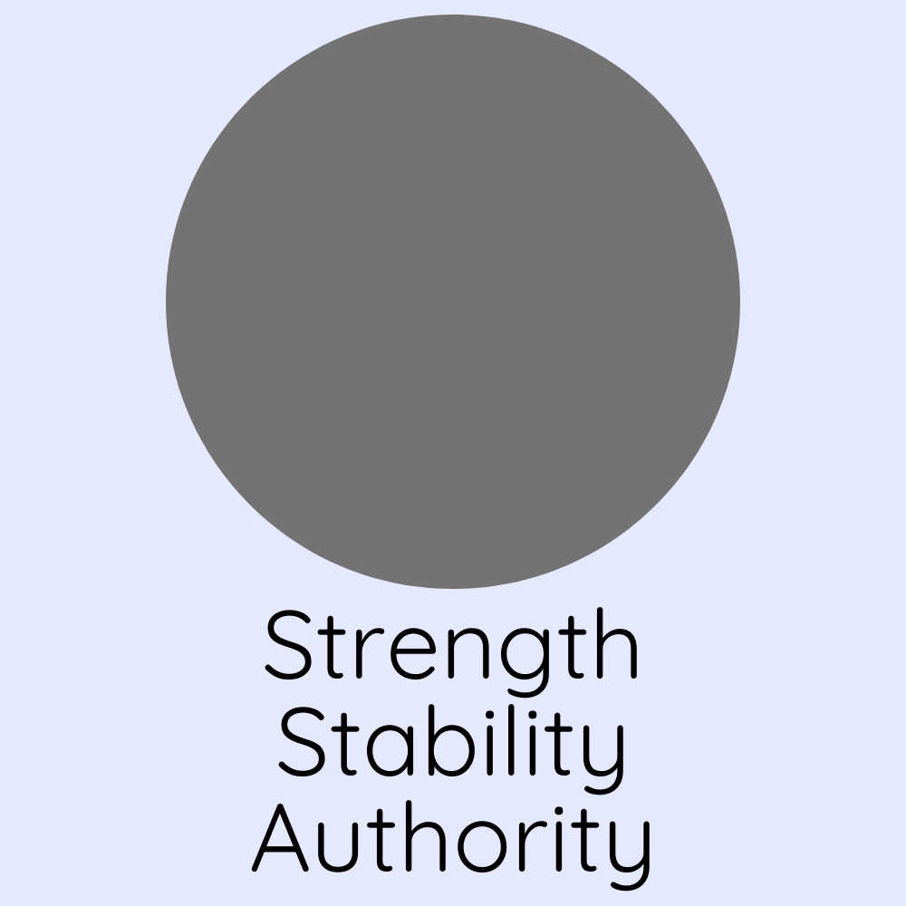
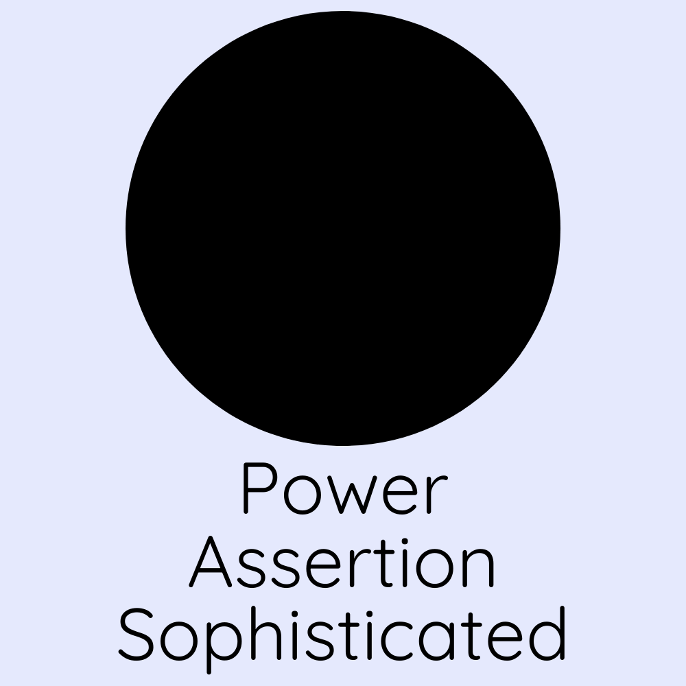
Colours are a powerful tool to amplify the emotions of viewers. Knowing which colours amplify which emotions is an important design tool that will help you maximise your design potential.
The Colour Wheel
You’ve probably seen this before - but do you know the ways to read and use it to your advantage? Listed below are some key ways you can apply colour theory using this tool.
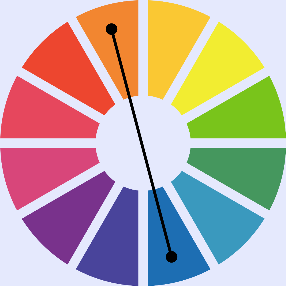
Complementary Colours
Using colours on opposite ends of the colour wheel spectrum creates high contrast, giving a bright and versatile appearance.
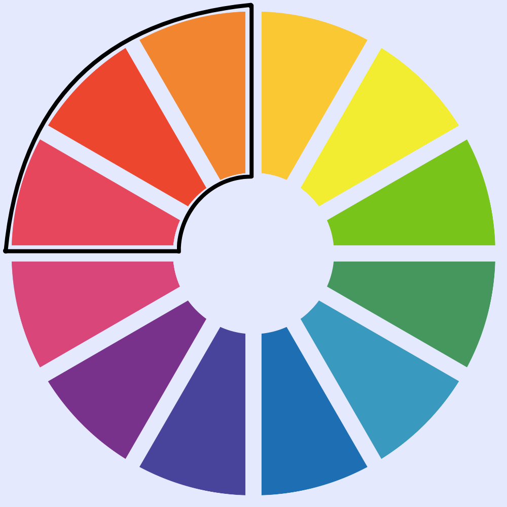
Analogous
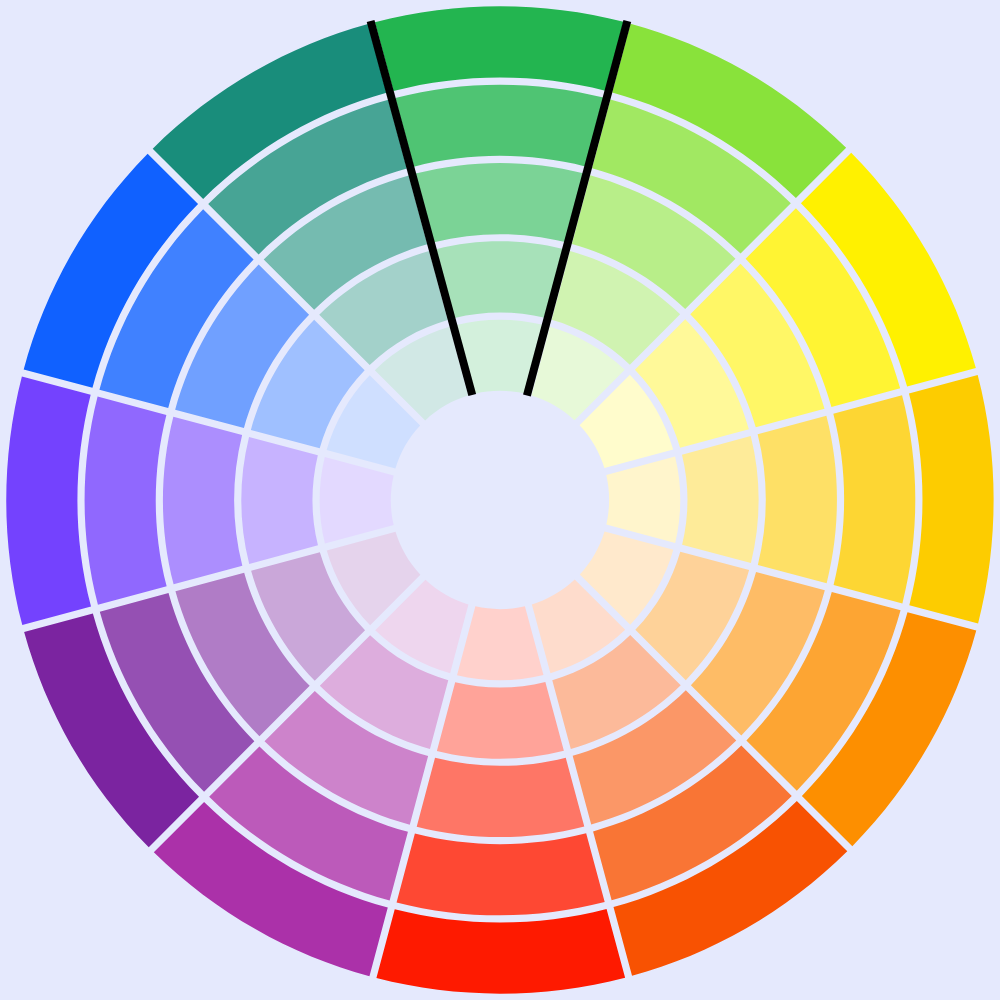
Colours neighbouring each other on the wheel can be great for bases to design, especially with a complementary colour used for primary elements.
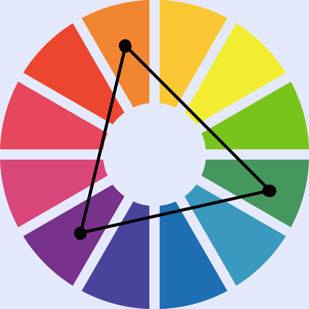
Triadic
This method involves using 3 colours from opposite ends of the spectrum. This creates a vibrant, eye-catching combination that is great for drawing attention to designs.
Monochromatic
This method is created using the same base colour, but of a different shade. This creates a harmonious contrast, and give uniform to your design.
Tetradic
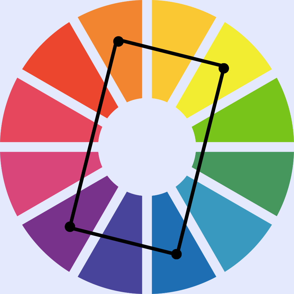
This involves 2 sets of primary colours found in a rectangular form. This creates bold statements, however must be balanced carefully to avoid making designs too chaotic.
Cool and Warm Tones
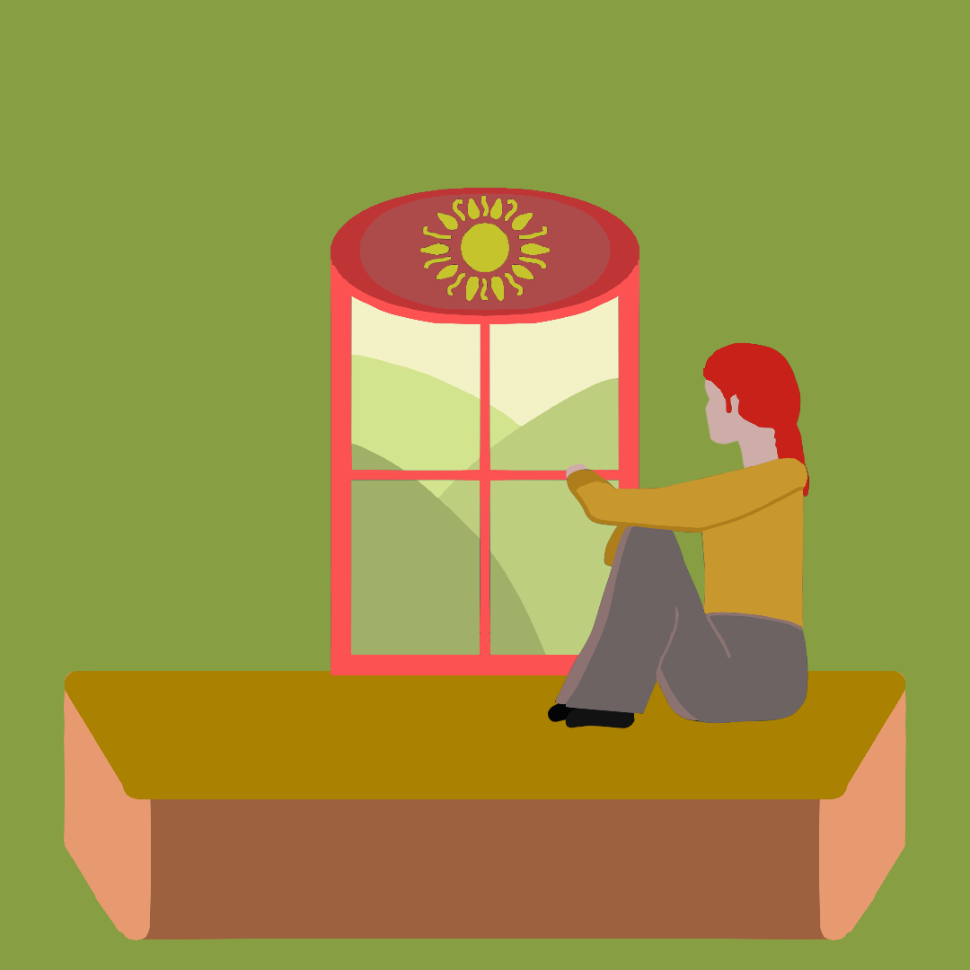
Warm tones lean towards hues of red and yellow, and are associated with feelings of energy, passion, and excitement.
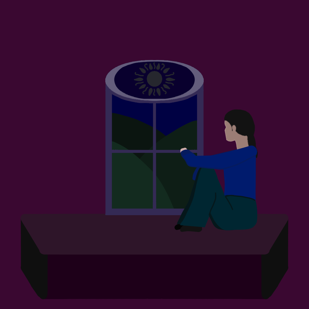
Cool tones are focused around blues, purple and green, and indicate calmness, trust and stability.
The below images are the same, but with colour changes invoke different feelings.
If you found this information useful, please feel free to donate and support tuture works: https://buymeacoffee.com/kg_socials
